
Choosing fonts for wall art: create stunning personal touches
Most people assume that the fancier the font, the better the wall art. That belief leads to script-heavy designs that look gorgeous on a screen but become nearly unreadable at six feet away. Font selection is one of the most underestimated decisions in home decor, and getting it wrong can turn a meaningful message into visual noise. This guide walks you through everything you need to know about picking fonts that are both beautiful and effective, whether you are designing art for your own home or searching for a truly thoughtful personalized gift.
Table of Contents
- Understanding the basics of wall art fonts
- Balancing style with readability
- Design principles: Color, sizing, and space
- Personalizing wall art for any occasion
- Our take: The overlooked secrets to memorable wall art
- Bring your vision to life with custom wall art
- Frequently asked questions
Key Takeaways
| Point | Details |
|---|---|
| Readability is key | Always choose fonts that are clear from a distance and match the room’s purpose. |
| Balance design elements | Use the 20-40-40 rule and high-contrast colors to ensure your wall art makes an impact. |
| Limit font variety | Stick to one or two fonts to avoid clutter and keep your design cohesive. |
| Test before finalizing | Preview your chosen font and layout at the intended size for best results. |
Understanding the basics of wall art fonts
With our minds open to the idea that looks aren’t everything, it’s important to cover what makes a good wall art font. Typography, the art of arranging type, is more than just picking something that looks pretty. Every font carries a personality, and that personality either reinforces or undermines your message.
Here are the four main font categories you’ll encounter when designing wall art:
- Serif fonts (like Times New Roman or Garamond): These have small decorative strokes at the ends of letters. They feel traditional, trustworthy, and classic. Great for formal quotes or family name signs.
- Sans-serif fonts (like Helvetica or Montserrat): Clean and modern with no extra strokes. They read easily at a distance and work well for minimalist or contemporary spaces.
- Script fonts (like Pacifico or Allura): Designed to mimic handwriting, these feel romantic and personal. They shine on single words or short names but struggle with longer text.
- Decorative fonts: Highly stylized and unique, these are best used sparingly, think one dramatic word or a logo-style accent.
“The mood of a room can shift entirely based on the font hanging on its wall. A script font says warmth and intimacy. A bold sans-serif says confidence and clarity.”
The biggest mistake people make is treating font selection as purely aesthetic. Context matters enormously. A busy kitchen needs something legible at a glance. A nursery calls for something soft and rounded. A home office might benefit from something structured and clean.
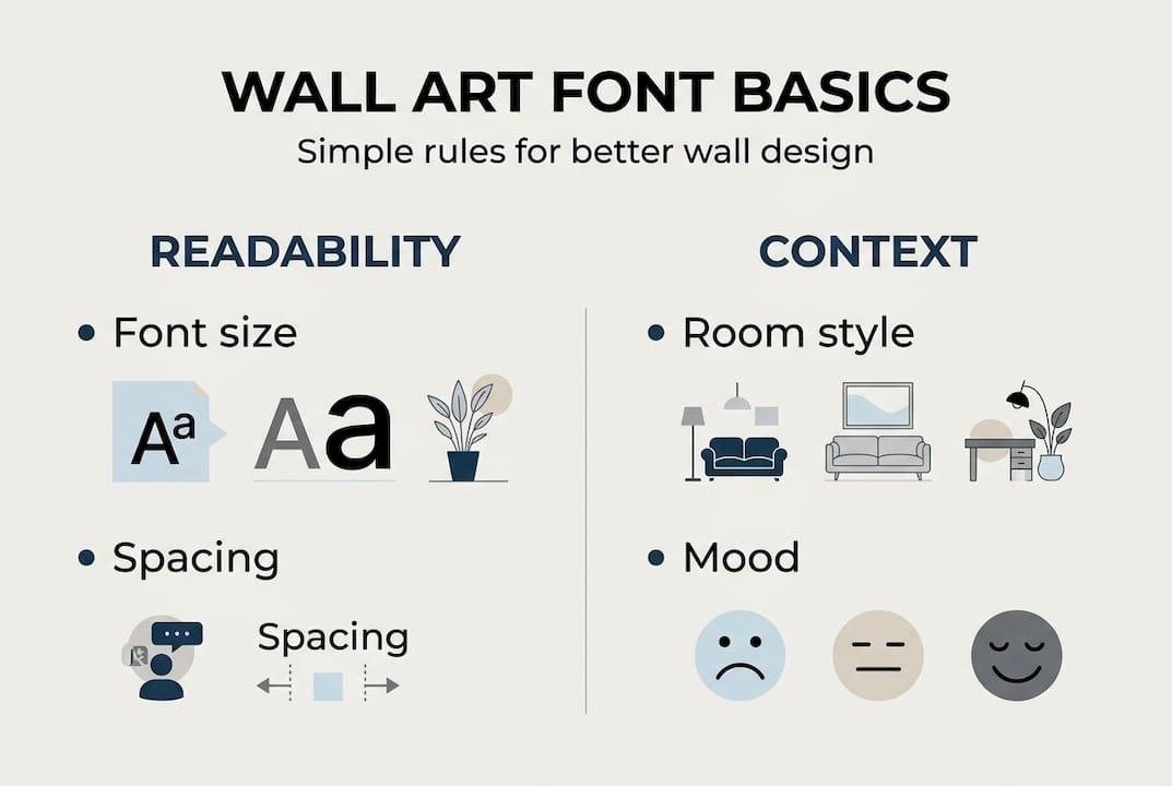
Readability also depends on the space between letters, the size of the text, and how much contrast exists between the font color and the background. As common wall art font mistakes show, over-styling is one of the most frequent problems homeowners run into. Avoid script for multi-line text or decorative fonts for body copy, and always test your design at the actual size and viewing distance before committing. Too many fonts or low contrast will reduce readability significantly.
Balancing style with readability
Now that you know what makes a font suitable for wall art, let’s look at how to balance style and legibility. The goal is never to choose between beautiful and readable. The goal is to find fonts where both qualities exist at once.
Here’s a quick comparison to help you decide which font type fits your situation:
| Font type | Best for | Pros | Cons |
|---|---|---|---|
| Serif | Formal quotes, family names | Classic, trustworthy feel | Can look stiff in casual spaces |
| Sans-serif | Modern decor, multi-line text | Clean, highly readable | May feel cold without pairing |
| Script | Short names, single words | Romantic, personal | Hard to read in long strings |
| Decorative | Accent words, logos | Eye-catching, unique | Overuse creates visual chaos |
A smart approach is to start with a body font for readability first, then layer in a headline font for contrast. This method ensures your message lands before the style dazzles. Adjust scale, spacing (kerning for letter gaps, leading for line gaps), and alignment as you go.
For legibility tips for personalized decor, viewing distance is a factor most people ignore until it’s too late. Art hung in an entryway is often read from ten feet away. Art above a bed is read from three feet. The same font at the same size behaves very differently in each scenario.
Pro Tip: Limit yourself to two fonts maximum on any single piece of wall art. Use one for the headline or name, and one for supporting text. This creates visual harmony without sacrificing personality.
Script fonts are stunning for a bride’s name on a wedding sign or a child’s name in a nursery. But if you’re designing a multi-line family quote, switch to a clean serif or sans-serif for the body text. The contrast between a script headline and a serif body actually creates a more sophisticated look than using script throughout.
Design principles: Color, sizing, and space
Once you’ve picked fonts that look good and read well, consider how design choices impact the final result. Even the perfect font can fail if the surrounding design elements work against it.

Contrast is king. Dark text on a light background, or light text on a dark background, is the foundation of readable wall art. Avoid placing gray text on a beige background or navy on dark wood. The 20-40-40 rule offers a reliable framework: 20% of your design should be text, 40% should be visual elements or images, and 40% should be open space. This balance prevents the crowded, overwhelming look that makes wall art hard to absorb.
Here’s how sizing and spacing break down in practice:
| Design element | Recommended approach | Why it matters |
|---|---|---|
| Font size | Larger for viewing distances over 6 feet | Ensures readability across the room |
| Kerning | Slightly wider for decorative fonts | Prevents letters from blending together |
| Leading | 1.2 to 1.5 times the font size | Keeps multi-line text from feeling cramped |
| Whitespace | At least 20% of total design area | Gives the eye room to rest and focus |
Follow these steps when reviewing your design before ordering:
- Print the design at actual size and tape it to the wall.
- Step back to the typical viewing distance for that room.
- Check whether every word is readable without squinting.
- Confirm the colors look correct under the room’s actual lighting.
- Ask someone else to read it cold, without knowing what it says, to test clarity.
Lighting is a factor most people overlook entirely. A font that reads beautifully in bright daylight may disappear under warm evening lighting. When choosing wall colors and art together, always test your combinations in the actual light conditions of the room.
Personalizing wall art for any occasion
Armed with strong design practices, let’s see how you can personalize fonts for special gifts or spaces. The occasion and location of your wall art should guide every font decision you make.
Here are some popular scenarios and the font approaches that work best:
- Wedding gifts: Pair a flowing script font for the couple’s names with a clean serif for the date and location. Elegant, timeless, and personal.
- Baby nurseries: Rounded sans-serif fonts feel soft and gentle. Avoid sharp or angular letterforms that feel too corporate for a child’s room.
- Kitchen decor: Bold, playful fonts work well for short phrases like “Gather here” or “Made with love.” Keep it readable from across the kitchen island.
- Home office: Structured serif or geometric sans-serif fonts reinforce focus and professionalism without feeling sterile.
- Memorial or tribute art: Classic serif fonts carry weight and dignity. Script can work for a name, but keep supporting text clean and simple.
Dos and don’ts for custom message design:
- Do keep your message to one clear idea per piece.
- Do use a mock-up tool to preview the design in your actual space.
- Don’t cram too much text onto a single canvas.
- Don’t use more than two font styles on one piece.
- Don’t sacrifice readability for a font you love in a thumbnail image.
As testing at actual size confirms, low contrast and too many fonts are the top reasons custom art disappoints buyers after delivery. The design that wowed you on a laptop screen may not translate to a 24-inch canvas on your living room wall.
Pro Tip: Before placing your order, use your phone to take a photo of the mock-up displayed on your wall. This gives you a real-world preview of how the art will look in context, including scale, color, and readability. Check out arranging personalized wall art for layout ideas that make your piece shine.
Our take: The overlooked secrets to memorable wall art
All the tactics above set you up for success, but there’s a deeper secret we’ve learned from years of helping people create custom wall art. The most memorable pieces are rarely the most complex ones.
We’ve seen customers agonize over decorative font combinations, layering three or four styles onto a single canvas, only to end up with something that feels busy and hard to love over time. Then we’ve seen a simple name in a clean, bold font bring someone to tears because it captured exactly the right feeling.
Emotional resonance beats visual complexity every single time. A font that is easy to read lets the words do the work. When the message is clear, it connects. When the design is cluttered, the message gets lost.
The uncomfortable truth is that most over-styled wall art is designed to impress at first glance, not to live with for years. The pieces that truly last are the ones where simplicity and meaning align. Think about displaying unique wall art not as decoration but as storytelling. The font is just the vehicle. The story is what people remember.
Bring your vision to life with custom wall art
Feeling inspired to create something truly unique? Here’s how you can bring your wall art vision to life.
Now that you understand how fonts, color, spacing, and personalization work together, the next step is putting those principles into practice. A well-designed piece of wall art does more than fill empty space. It tells a story, marks a moment, and makes a home feel like yours.
At FunLifeNow, we specialize in helping you turn meaningful words and ideas into beautifully crafted, American-made wall art. From canvas prints to metal signs, every piece is customizable with the fonts, colors, and messages that matter most to you. Browse our full range of personalized wall art options and start designing something you’ll love for years to come. The process is simple, the results are stunning, and the gift is unforgettable.
Frequently asked questions
What is the best font size for wall art?
Font size depends on viewing distance, but larger text is almost always the safer choice for readability across a room. Test scale and actual size by printing your design before ordering.
Should I use more than one font on wall art?
Limiting to one or two fonts keeps your design clean and easy to read. Using too many fonts reduces readability and creates visual confusion that distracts from your message.
How do I pick colors that make fonts stand out?
High contrast between font and background is the most reliable approach, such as dark text on a light surface or vice versa. High contrast colors ensure your message reads clearly in any lighting condition.
Are script fonts okay for quotes on wall art?
Script fonts work beautifully for short names or headline words, but avoid script for multi-line text or detailed quotes because the letterforms blur together and become difficult to read at a distance.