
Choosing the Right Font for Personalized Home Decor
Choosing the right font for your personalized decor can feel as personal as choosing colors for your living room. Fonts do more than shape letters—they express emotion and set the tone for every custom accent, whether you want your space to feel cozy or bold. This guide helps you connect your decor style with the perfect typography, making it easier to create pieces that radiate your personality and give every gift or room an unmistakably authentic touch. For homeowners who value quality craftsmanship and emotional resonance, finding that harmony transforms decor from ordinary to unforgettable.
Table of Contents
- Step 1: Assess Your Personalization Theme And Message
- Step 2: Identify Font Styles That Match Your Decor Vision
- Step 3: Evaluate Font Readability And Emotional Impact
- Step 4: Test Chosen Fonts On Your Custom Design Preview
- Step 5: Verify Legibility And Aesthetic On Your Final Product
Quick Summary
| Key Point | Explanation |
|---|---|
| 1. Define your theme clearly | Establish the emotional story you want your decor to communicate, guiding font selection effectively. |
| 2. Choose font styles matching your vision | Select serif for elegance and tradition, sans-serif for modern vibes to align with your personalization theme. |
| 3. Test for readability at distance | Ensure fonts are legible from the intended viewing distance to maintain clear communication in your decor. |
| 4. Preview fonts on actual design | Use a font tester to visualize how your selections look on the piece, checking for visual harmony and contrast. |
| 5. Verify legibility on the final product | Examine the finished decor in real lighting to ensure it matches your vision and is easily readable. |
Step 1: Assess your personalization theme and message
Before you select a single font for your personalized home decor, take time to define what your space should communicate. Your theme is the visual and emotional story you want your decor to tell. Are you creating something that feels warm and traditional, or modern and minimalist? Is your piece meant to celebrate a milestone, honor a loved one, or simply reflect your everyday personality? The clearer you are about your theme, the easier font selection becomes because you’ll have a concrete vision guiding every decision.
Start by asking yourself what message matters most. If you’re creating personalized home accents to commemorate a marriage anniversary, your message might emphasize timelessness and romance. A piece celebrating a child’s birth might convey joy and innocence. Think about the room where your decor will live too—a bedroom calls for different messaging than a living room that hosts gatherings. Once you know your theme and message, you can make font choices that reinforce rather than contradict what you’re trying to express. Understanding how different font styles communicate mood is crucial here. Serif fonts can express elegance and tradition, while sans-serif fonts convey modernity and simplicity. When your font aligns with your personalization theme, the whole piece feels intentional and cohesive.
Write down your theme in one or two sentences. Next to that, list the emotions or qualities you want your piece to evoke. Are you aiming for sophistication, playfulness, nostalgia, or strength? List any specific words or names that will appear on your decor, because different fonts will make those words carry different weights and meanings. This simple exercise transforms an abstract idea into something concrete you can actually work with when comparing font options.
Pro tip: Gather inspiration by looking at existing home decor you love and noting which pieces resonate with you—this tells you what visual direction your theme naturally wants to go, making font selection feel less overwhelming and more authentic to your taste.
Step 2: Identify font styles that match your decor vision
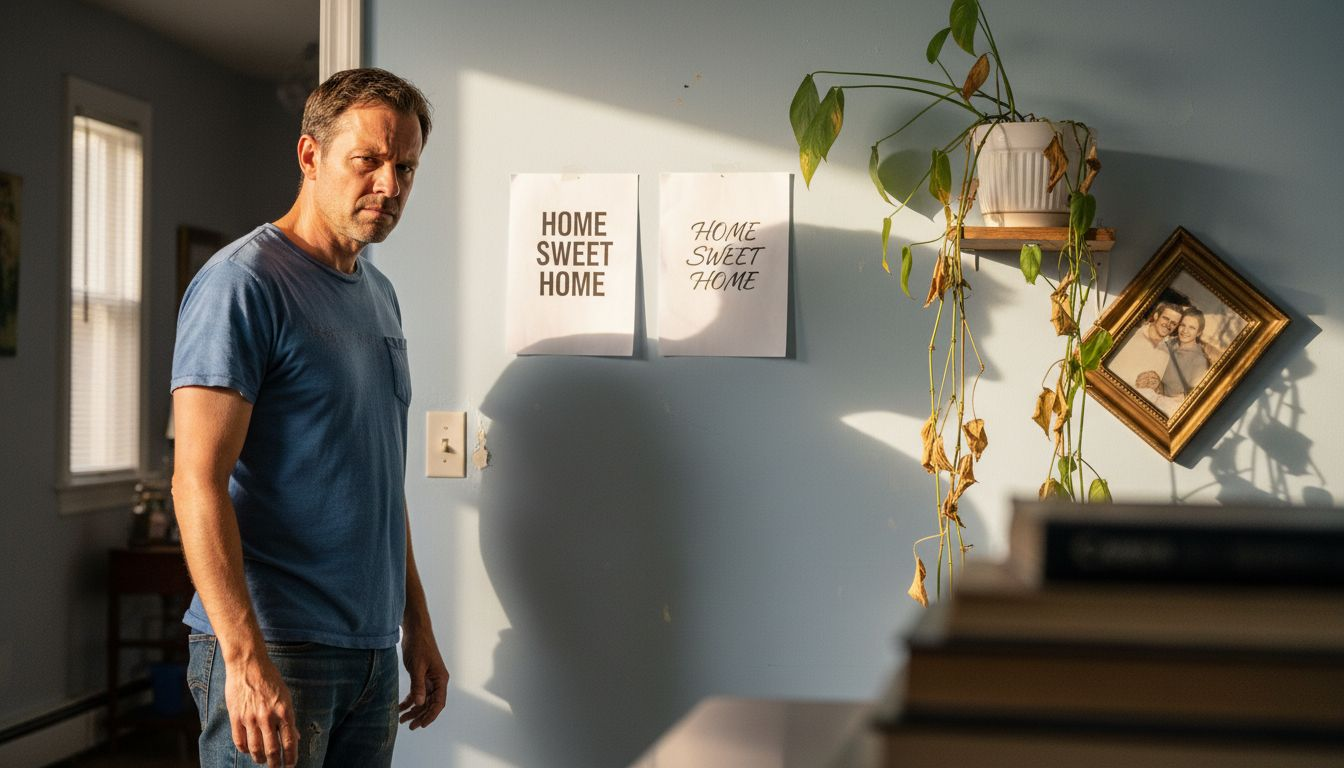
Now that you know your personalization theme, it’s time to explore which font styles will bring that vision to life. Different typefaces carry distinct personalities. Serif fonts, with their small lines extending from letter edges, feel classic, elegant, and timeless. They work beautifully for traditional, vintage, or sophisticated decor themes. Sans-serif fonts, without those decorative lines, project a clean, modern, and minimalist aesthetic. If your vision leans contemporary or you want something crisp and straightforward, sans-serifs are your allies. Beyond these two main categories, outline fonts provide unique visual appeal when you want your personalized decor to demand attention and creativity, making them ideal for bold statements in large sizes.
Start by looking at fonts within the category that matches your theme. If you chose a rustic or vintage direction, browse serif options that feel warm and established. For a modern minimalist space, explore sans-serifs that feel clean without being cold. Most font websites let you preview how different typefaces appear at various sizes, which matters enormously for home decor since your text might be displayed at 24 inches tall on a canvas or 6 inches on a metal sign. Seeing the actual size helps you understand if a font feels right for the scale of your piece. Pay attention to font weight too, the thickness of the letters. A light weight feels delicate and refined, while bold weights command presence and authority. Your chosen font should feel like a natural extension of the message you defined in the previous step, not something fighting against it.
Before finalizing, test your top font choices by typing out the exact text that will appear on your decor. Does it feel right when you see it rendered at the actual size it will be displayed? Does it match the emotional tone you want? If you plan to use personalized home accents with multiple text elements, consider whether your chosen font will work across all of them or if you need variety. This is where you move from theory into practical reality, and it’s the best way to catch any hesitations before you commit.
Pro tip: If you love a bold, eye-catching outline font, pair it with a simpler, classic font for secondary text to maintain visual balance and ensure your decor stays harmonious rather than overwhelming.
Here is a quick comparison of common font styles and their emotional impact in personalized home decor:
| Font Style | Visual Character | Best For Decor Types | Emotional Effect |
|---|---|---|---|
| Serif | Classic, refined | Traditional, vintage | Elegant, timeless |
| Sans-serif | Clean, simple | Modern, minimalist | Contemporary, fresh |
| Outline | Bold, statement | Large feature pieces | Creative, attention-getting |
| Script | Flowing, ornate | Romantic, celebratory | Personal, intimate |
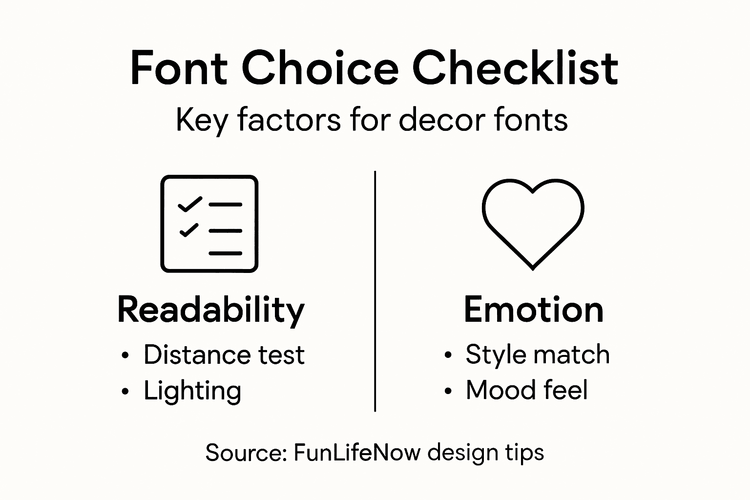
Step 3: Evaluate font readability and emotional impact
You’ve narrowed down your font choices, but now comes the crucial test. A beautiful font that looks stunning in a display size might become nearly impossible to read when someone stands across the room looking at your personalized decor piece. Readability and emotional impact work together, not against each other. A font can be visually striking and still communicate your message clearly. Conversely, a technically readable font might evoke the wrong feeling entirely. This step asks you to examine both dimensions carefully before making your final decision.
Start by testing readability at the actual distance where people will view your decor. If your piece will hang on a living room wall, step back 10 feet and ask yourself if you can comfortably read the text without squinting. If it’s a tabletop item, view it from a typical sitting distance. Consider the contrast between your text and the background too. Dark text on a light background generally reads better than light text on dark, though both can work with the right font choice. Now think about the emotional tone your font conveys. Font readability varies significantly among individuals, and selecting fonts that enhance ease of reading improves engagement, but equally important is whether that font makes someone feel welcome, inspired, nostalgic, or comforted. A delicate script font whispers intimacy and elegance, while a bold, blocky sans-serif announces confidence and strength. Does your chosen font match the emotional message you want to leave with anyone who sees your decor?
Create a simple test by printing or displaying your top two font choices with your exact text at the actual size it will appear. Live with these versions for a few days. Show them to trusted friends or family members and ask what feeling they get from each one. You’ll likely notice that one option resonates far more authentically with your original vision. That’s your signal. The best font choice satisfies both requirements simultaneously, delivering crystal-clear readability while evoking the precise emotional response you intended. Trust both your eyes and your gut on this decision.
Pro tip: If your chosen font feels perfect emotionally but slightly hard to read, increase the letter spacing or bump up the font size rather than switching to a different typeface, since these small adjustments often solve readability without sacrificing the personality you love.
Step 4: Test chosen fonts on your custom design preview
This is where theory becomes reality. You have your theme, you’ve selected a font that matches your vision, and you’ve confirmed it reads well. Now you need to see exactly how it looks on your actual personalized decor piece before you finalize anything. Testing your chosen font in a realistic preview eliminates surprises and gives you confidence that your selection will work beautifully when the final product arrives at your door.
Start by using a font tester to preview how selected fonts appear in your custom text, allowing you to compare different weights, sizes, and spacing in your specific design context. Most customization platforms offer this feature built right into their design tools. Type your exact message into the preview, then experiment with how the font looks at different sizes. For instance, if your personalized piece includes both a main message and a smaller secondary line, test both sizes together to see if they harmonize visually. Look at the font against the background color you’ve chosen. Does it pop with enough contrast? Does the spacing between letters feel right, or does it look cramped or too loose? This is also the time to play with letter spacing and line spacing if your design tool allows it. Sometimes a font that felt almost perfect becomes absolutely perfect with just a touch more breathing room between letters.
Pay attention to how the font looks in different sections of your design. If your personalized decor includes decorative elements around the text, does the font style complement them or clash with them? Zoom in and zoom out. View it on your phone, tablet, and computer monitor to see it at various scales. Show your preview to the person who will receive the gift or live with the piece daily. Their honest reaction tells you volumes. If everyone who sees it smiles and reads the message easily, you have your winner. If anyone hesitates or squints, loop back to font weight or size adjustments before you commit.
Pro tip: Don’t finalize your design on a phone screen alone; the text might look completely different when printed or displayed at actual size, so always test your preview on a larger monitor or printed mockup to catch any issues before production.
Step 5: Verify legibility and aesthetic on your final product
Your personalized decor is almost ready to ship or display. Before you celebrate, take one final moment to verify that your font choice looks exactly as intended on the physical product. This verification step catches any last-minute issues and confirms that your months of planning translate into a piece you absolutely love. What looks perfect on a computer screen sometimes reveals surprises once it’s printed on canvas, engraved on metal, or stitched onto fabric.
Carefully examine your finished piece in the actual lighting where it will be displayed. If it’s destined for a bedroom, look at it under bedroom lighting. If it’s heading to a kitchen, check it there. Different lighting dramatically affects how fonts appear. What reads beautifully in bright daylight might become murky under warm yellow lamps, or vice versa. Check legibility from multiple distances and angles, just as you did with the preview. Verifying legibility in the final product involves ensuring font sizes and styles remain clear and readable in your actual display or print format. Can you read every word comfortably without squinting? Does the font still feel stylistically aligned with your vision now that you’re seeing it in three dimensions or on the physical material? Sometimes a font that looked great on screen feels different when you can touch it or see how it interacts with the texture of the substrate.
Beyond the visual check, think about the practical implications of your choice. If your personalized decor is a gift, imagine the recipient’s reaction. Does the font feel warm and welcoming, or does something feel slightly off? Trust your instincts. This is also the moment to consider whether font licensing for your personalized decor project is properly authorized, especially if you’re producing items commercially or sharing your design widely. Many fonts come with specific usage rights, and confirming compliance protects your investment in this beautiful creation.
Below is a summary of key factors to review before finalizing your personalized decor font choice:
| Factor | Why It Matters | What to Check |
|---|---|---|
| Readability | Ensures clear communication | Can you read it from intended distance? |
| Emotional Fit | Aligns mood with your intent | Does it evoke your desired feeling? |
| Size & Weight | Maintains balance in the design | Is it too bold or too light? |
| Surface & Lighting | Impacts final legibility and style | Still readable in real environment? |
Pro tip: If something doesn’t feel quite right once you see the final product, many manufacturers offer revisions or adjustments; don’t hesitate to reach out and request tweaks to font size, weight, or spacing rather than settling for something that doesn’t match your vision.
Elevate Your Personalized Home Decor With the Perfect Font Choice
Choosing the right font for your personalized home decor can be challenging. The article highlights key concerns like matching your theme, ensuring readability, and capturing the right emotional tone for your space. You want your decor to tell a meaningful story with fonts that feel intentional, cohesive, and easy to read—even from across the room. At FunLifeNow, we understand how important these details are when creating a truly personal piece that connects emotionally and enhances your home’s atmosphere.
Discover our collection of custom-made blankets, canvas wall art, and metal signs at FunLifeNow where you can bring your vision to life. Our American-made products combine quality craftsmanship with seamless personalization so you can select fonts, add names, dates, and messages that perfectly express your unique style and story. Don’t wait to make your house feel like home with personalized accents that speak from the heart. Start customizing your perfect piece today by visiting FunLifeNow and explore how thoughtful font choices enhance every detail of your decor.
Frequently Asked Questions
How do I determine the best font style for my personalized home decor?
To determine the best font style for your personalized home decor, start by identifying the overall theme and message you want to convey. List the emotions or qualities you aim to evoke and explore serif or sans-serif options that align with your vision; for example, serif fonts for a classic feel and sans-serif for a modern touch.
What factors should I consider when evaluating font readability in home decor?
When evaluating font readability, test the font from various distances where it will be viewed, ensuring that it remains legible. Check the contrast between text and background and consider how the font size and weight influence clarity; for instance, avoid overly intricate designs that may become hard to read from afar.
How can I ensure my chosen font aligns with the emotional tone of my decor?
To ensure your chosen font aligns with the emotional tone, assess whether the font type evokes the feelings you want to communicate. Print or preview your text in the selected font and observe how it resonates with your intended message; this can clarify if adjustments are needed before finalizing your design.
What steps should I take to test font options for my personalized decor?
Test font options by using a font preview tool or creating mock-ups of your personalized piece. Type out the exact text at the size and weight it will appear, and review it in the setting and lighting where the decor will be displayed; this step helps catch any potential issues before production.
How do I verify the final product’s legibility after design completion?
To verify the final product’s legibility, examine it under the specific lighting conditions it will be displayed in. Read the text from various distances and angles to confirm that every word remains clear; consider making adjustments if anything feels hard to read before accepting the final version.